
How Much Could Your Portfolio Fall During Retirement?
 Lorenzo Foti
A retirement simulation is often reduced to one number: the probability that the plan succeeds.
Suppose someone retires at 65 with €1 million and the simulation shows a 95% probability of funding all planned spending through age 95. That is an important result. In 95 out of every 100 simulated futures, the portfolio can meet every cash requirement in the plan.
Those 95 successful retirements can still look very different.
In one scenario, the portfolio may remain close to €1 million throughout retirement and eventually finish with €800,000. In another, it may fall to €550,000 during a difficult period, recover later and also finish with €800,000.
Both paths successfully fund the same lifestyle, but living through them would probably feel very different.
This is where the quality of a retirement path becomes important. The probability of success tells us whether the money lasts. Looking at capital depletion tells us how much of the portfolio may disappear along the way.
Success tells us whether the plan can fund retirement
Consider a simple retirement plan.
The person retires at 65 with €1 million invested, plans to spend €40,000 a year with spending increasing with inflation – yes, the famous 4% rule, and wants the plan to last until age 95. There is no state pension, rental income, annuity or other cash flow. The portfolio funds the whole retirement.
With a 60% stocks / 40% bonds portfolio, the simulation produces a 75% probability of success (see assumptions1). Surprised it is this low? Did you know that the 4% rule works only when applying a specific set of assumptions?
If you include non-US market returns, taxes and a different plan duration, results change significantly. Article on this coming soon.
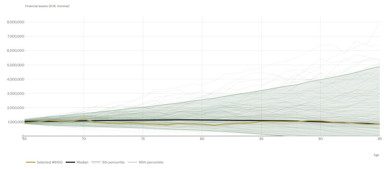
If you want to know how the probability of success is calculated and what does the above chart mean, read this article.
In the example above, every successful scenario funds all thirty years of planned spending, but the simulation does not require those scenarios to follow a comfortable path.
One may fall only 5% below the retirement portfolio. Another may lose 25%. Another may at some point have only half of the original capital remaining and still recover enough to complete the plan.
The success rate counts all of them as successful.
For someone preparing to stop working, there is another useful question:
Even if my retirement plan succeeds, how much of my starting capital might I have to watch disappear?
Measuring capital depletion from the day retirement begins
Retirement capital provides a natural reference point.
If someone retires with €1 million, we can compare the lowest portfolio value reached later with that initial €1 million.
If the lowest value is €950,000, maximum capital depletion is 5%. If it reaches €800,000, depletion is 20%. A minimum of €500,000 represents 50% depletion. If the portfolio reaches zero, depletion is 100%.
A portfolio that remains above €1 million throughout the period has 0% depletion by this measure.
These figures describe the portfolio value after withdrawals needed to fund the desired lifestyle (in the example above, €40,000 per year adjusted for inflation). They include the effect of money spent during retirement as well as investment performance.
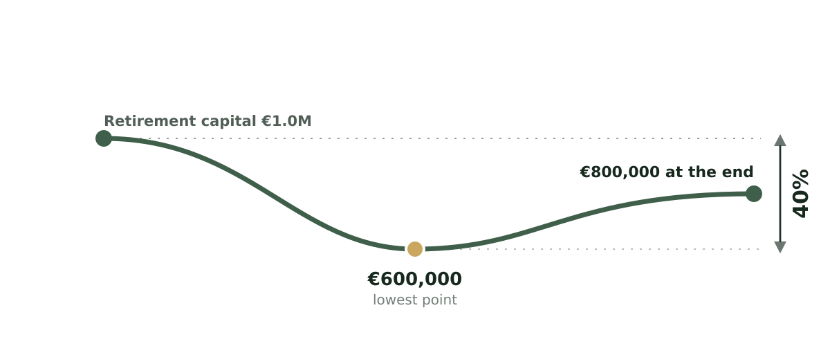
Running the same calculation across thousands of simulated retirements creates a distribution.
Instead of asking whether the portfolio ever falls below €800,000, for example, we can see how frequently different degrees of depletion occur:
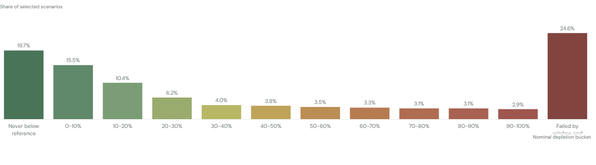
Each scenario belongs to one bucket based on the deepest depletion it experiences during the selected period.
If 6.2% of paths fall in the 20–30% bucket, for example, those paths reach a lowest point between 20% and 30% below the capital available at retirement.
The chart shows the frequency of each outcome rather than a cumulative probability. It describes the shape of the possible retirement experience.
A successful retirement can still contain a large loss
The distribution becomes particularly interesting when we look only at successful scenarios.
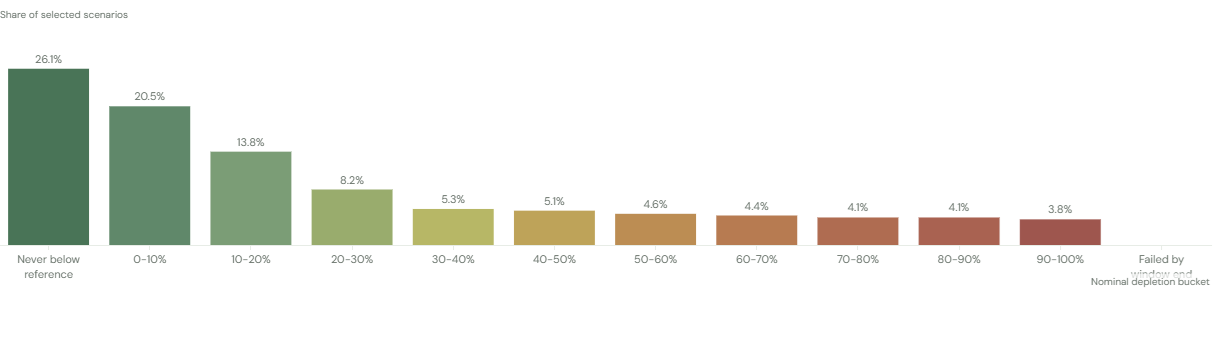
Suppose the original plan succeeds in 75% of simulations. Among those successful paths, only 46% keep depletion below 10%. Another 22% experience a loss of 10–30% from retirement capital, while 26% (1 out of 4!) fall by more than 50% at some point and still manage to fund every planned expense.
The exact numbers depend on the portfolio, spending and length of retirement, but the distinction matters.
A person may be comfortable with a plan that has a 95% probability of funding retirement. They may feel very differently after learning that a substantial share of those successful retirements involve watching a €1 million portfolio fall to €600,000 or €500,000 along the way.
This creates two separate objectives.
The first is to fund the lifestyle.
The second is to preserve enough capital stability to make the journey tolerable.
Requiring both makes the plan more demanding. A retirement that must succeed while also keeping the portfolio within 10% of its starting value requires considerably more protection than a retirement where temporary depletion of 30% or 40% is acceptable.
The timing of depletion matters
A 40% depletion five years after retirement tells a different story from a 40% depletion at age 92.
The first occurs while most of the retirement still lies ahead. The portfolio has already lost a large share of its starting value and must continue funding decades of spending.
The second may occur after almost thirty years of withdrawals have already been successfully funded.
Looking only at maximum depletion over the full retirement combines these situations.
The distribution can therefore be viewed over different parts of the plan.
During the first five years of retirement, the chart shows the losses a new retiree might face almost immediately after leaving work. Extending the window to the first ten years captures more of the early retirement period. Looking at the full retirement shows the deepest depletion experienced anywhere in the plan.
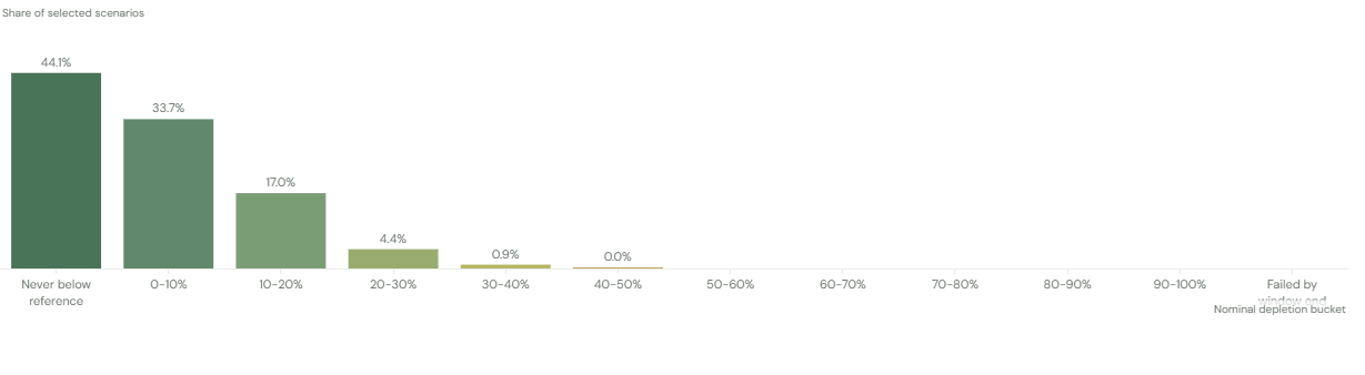
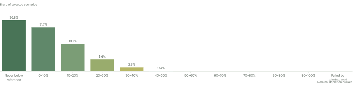
As the window becomes longer, larger depletion naturally becomes more common. The portfolio has funded more spending, experienced more market cycles and had more opportunities to fall below its starting level.
In Myriada’s simulation, the plan's success result still refers to the full retirement horizon. Changing the depletion window changes the period over which the lowest capital level is measured.
This allows the same plan to answer two useful questions at once: whether retirement is ultimately funded, and how difficult the journey may become during a particular stage of life.
Looking inside the distribution
The overall histogram combines many kinds of retirement paths. Filtering them can reveal where the risk comes from.
The paths can be grouped by their final outcomes. The bottom 10% or 20% of simulations show what difficult market and spending sequences look like. The middle of the distribution describes more typical paths, while the strongest outcomes show what happens when returns are favourable.
In the example above, even a successful plan that ends up in the top 25% of the scenarios can still experience a depletion of up to 20% of the portfolio with a 40% probability!
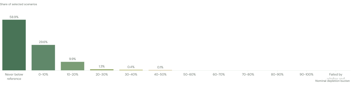
This gives more context than a single worst-case scenario. A 60% depletion that occurs in one path out of ten thousand deserves a different interpretation from a 40% depletion that occurs in one out of every four successful retirements.
The frequency matters.
Asset allocation changes the shape of the journey
Investment allocation changes both the probability that the portfolio survives and the path taken along the way.
Consider the same retiree, the same €1 million starting portfolio and the same spending plan. Now run the simulation with multiple stocks / bonds allocations: 100/0, 20/80, 40/60, 60/40, 80/20, 100/0.
A portfolio with more stocks will usually experience wider short-term movements. The depletion distribution may therefore show more scenarios with substantial temporary losses, particularly during the early years of retirement.
A portfolio dominated by bonds will normally move less from year to year, but lower expected growth creates another pressure. The retiree continues withdrawing money while the portfolio has less capacity to replenish what is being spent. Over a long retirement, capital can be depleted steadily even without a dramatic market crash.
The result can be counterintuitive. A more conservative portfolio may show fewer sudden drawdowns while still producing more paths with deep eventual depletion or outright failure.
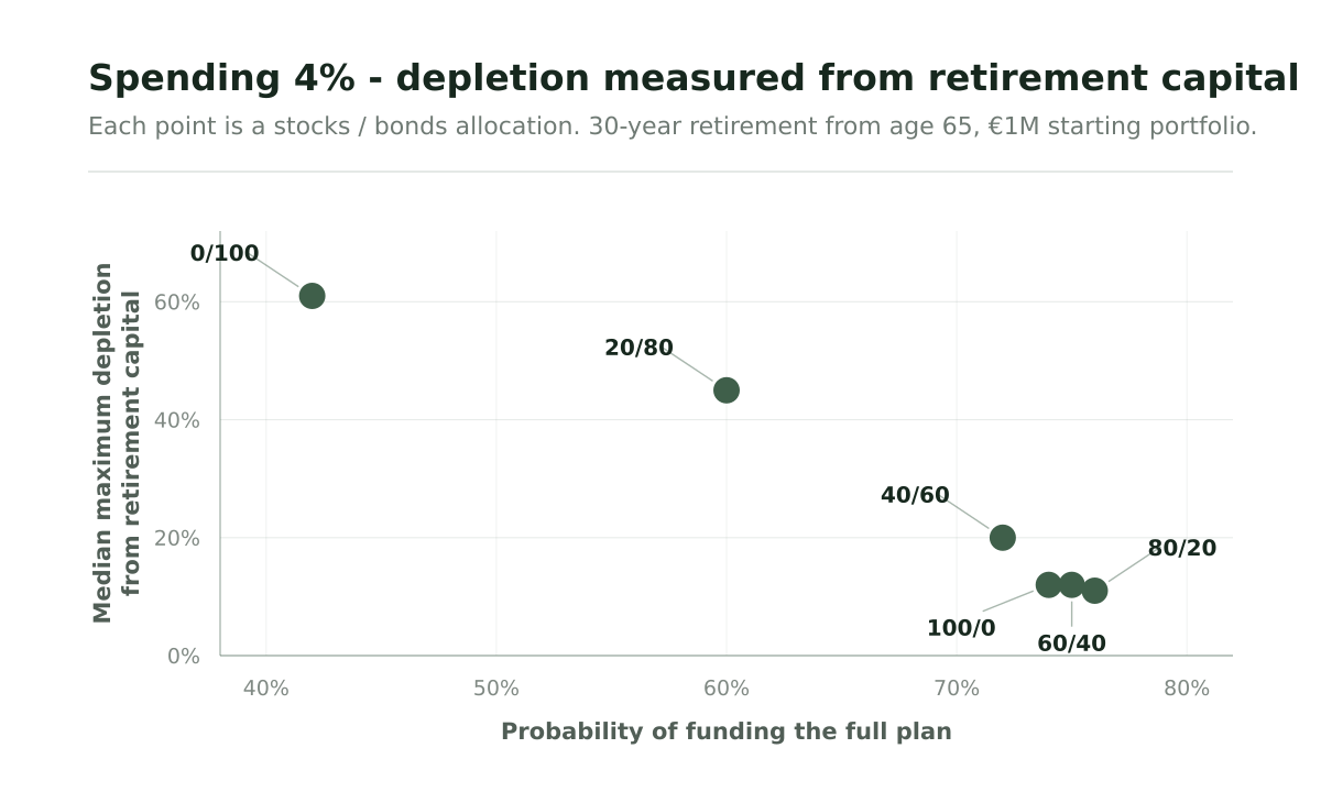
Each point represents a stock/bond allocation. The horizontal axis shows the share of all scenarios that fund the full plan. The vertical axis shows the median of each successful path's maximum depletion: half experience a depletion at or below that value, and half at or above it.
With retirement starting at 65 and a 4% spending rule, the all-bond portfolio funds roughly 42% of scenarios. Even among those successful paths, median depletion is around 62%: a gradual decline can produce substantial depletion even without a market crash when the portfolio return isn't high enough to fight inflation-adjusted withdrawals over 30 years.
For the 60% stock / 40% bond portfolio, success rises to about 75% and median depletion falls to around 12%. The balance reflects both investment performance and money withdrawn for living costs.
In this specific scenario, the 80% stock / 20% bond portfolio is Pareto superior, having the best success rate and lowest median depletion. Please note that this results are heavily dependent on the assumptions chosen for market returns and inflation1.
Reducing the spending to 3% changes the comparison.
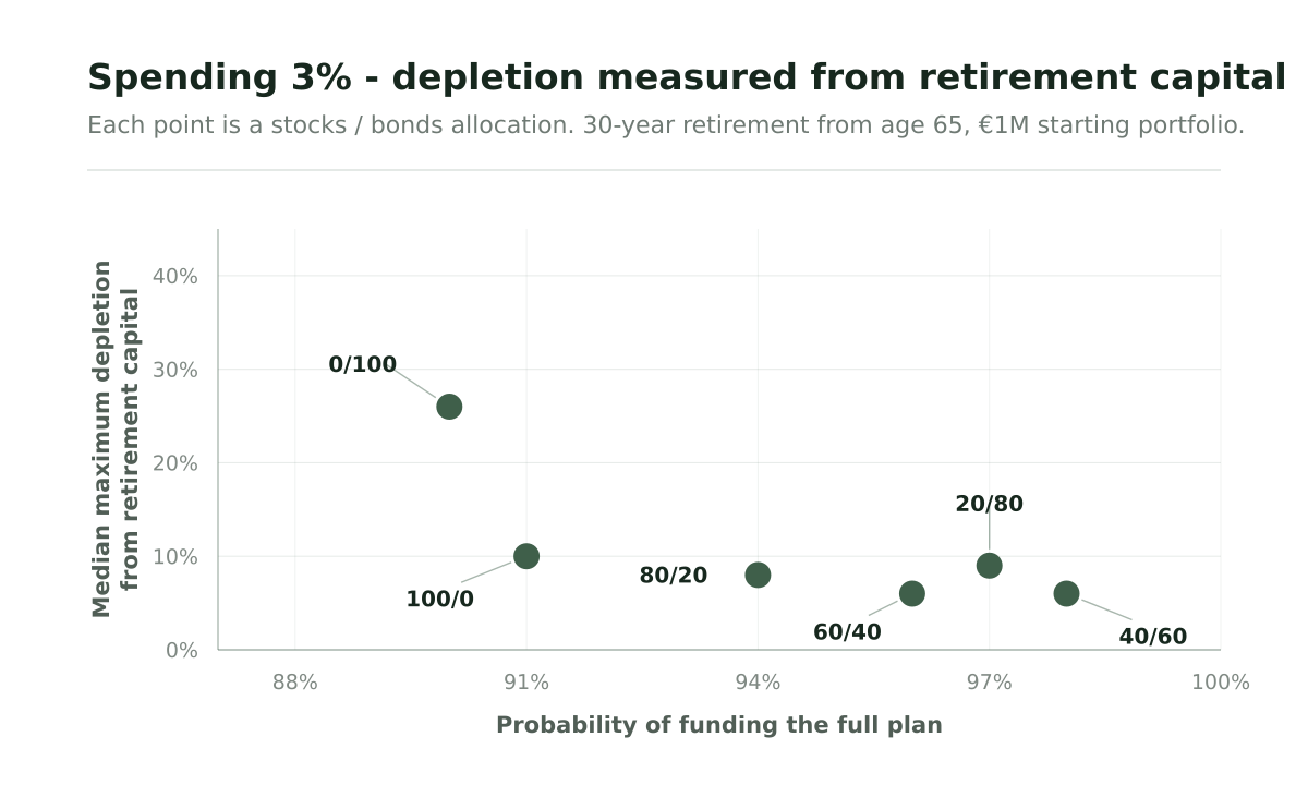
Success rates rise across all allocations, and median depletion falls. The portfolio now has less spending to replace each year, which changes how much investment growth the plan needs.
The 40% stock / 60% bond portfolio combines the highest funding probability in this set of results, approximately 98%, with median depletion of around 6%. The 60/40 portfolio has a similar median depletion and a funding probability of about 96%.
Increasing the stock allocation further produces weaker results on both measures in this example. The all-stock portfolio funds about 91% of scenarios, with median depletion around 10%. At the other extreme, the all-bond portfolio funds roughly 90%, but its successful paths have a much higher median depletion of approximately 26%.
The comparison illustrates how spending changes the role of asset allocation. At the higher spending level, portfolios with a substantial stock allocation achieve stronger funding results and retain more of their original capital in the median successful path. At the lower spending level, more balanced allocations achieve those objectives more consistently under the assumptions used.
These results depend on the investment returns, inflation and other assumptions in the model. Each allocation also has its own group of fully funded paths, so the medians describe different sets of successful retirements. The depletion histograms remain important for understanding the more severe experiences beyond the median.
Retirement depletion captures only one kind of loss
Using retirement capital as the anchor answers an intuitive question: how far below the amount I had when I stopped working might I fall?
But the portfolio may rise substantially before a later decline.
Suppose someone retires with €1 million.
During a strong market period, the portfolio grows to €1.5 million and eventually reaches €2.5 million. A severe downturn then reduces it to €1.25 million.
Measured against the original €1 million retirement portfolio, there has been no depletion. The person still has 25% more capital than when retirement began.
From the €2.5 million peak, however, the portfolio has fallen by 50%.
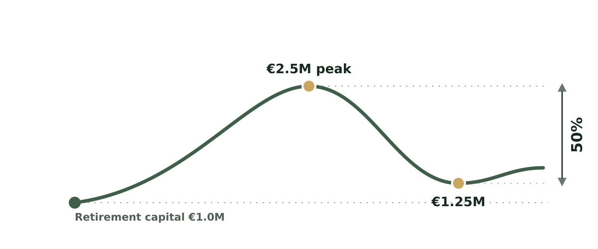
That loss is captured by a second measure: peak-to-trough depletion.
Peak depletion measures the largest percentage decline from any previous portfolio high to the lowest point that follows it.
The two measures answer different questions:
For the €1 million → €2.5 million → €1.25 million path, retirement depletion is 0%, while peak depletion is 50%.
Both descriptions are true. They capture different parts of the experience.
Why a depletion from a peak can still be difficult
People adapt quickly to a higher level of wealth.
After several years with a portfolio around €2.5 million, that amount may become a new reference point. A subsequent decline to €1.25 million means watching half of that balance disappear, even though the portfolio remains above the €1 million available when retirement began.
That can affect financial decisions.
A retiree may reduce spending much more aggressively than the plan requires. They may sell investments after a large decline, change asset allocation or begin questioning whether they should return to work.
These reactions matter because a retirement strategy has to be followed through difficult periods for its long-term assumptions to remain useful.
Peak depletion therefore adds another dimension to retirement quality. Retirement depletion shows the erosion of the original financial base. Peak depletion captures the severity of losses experienced after wealth has grown.
Asset allocation has again a key impact over peak depletion. Let's see what happens to success rate and median depletion with a 4% spending when measuring depletion from the previous peak.
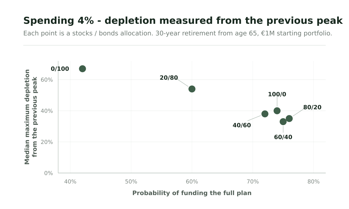
The success rates remain unchanged because we are examining the same simulated paths. Only the reference used to measure depletion has changed.
For the 60/40 portfolio, median maximum depletion rises from around 12% of retirement capital to approximately 33% from a previous peak. For the 80/20 portfolio, the figures are about 11% and 35%. For the all-stock portfolio, they are approximately 12% and 40%.
Those allocations looked very similar when measured against the original €1 million. The peak-based view reveals a wider difference in the declines experienced along the way.
It also changes the comparison between 60/40 and 80/20. The 80/20 portfolio retains its slightly higher success rate, while the 60/40 portfolio now shows the lower median depletion. The choice involves a small difference in funding probability alongside a difference in the size of falls from earlier highs.
The lower-spending plan makes this distinction especially clear.
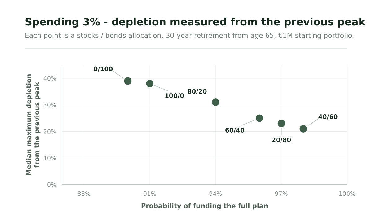
With first-year spending of €30,000, the 40/60 portfolio has median depletion of around 6% from retirement capital, compared with approximately 21% from a previous peak. For the 60/40 portfolio, the corresponding figures are about 6% and 25%.
The gap is larger for the all-stock portfolio: approximately 10% from retirement capital, but 38% from a previous peak. Among its fully funded paths, around half therefore experience a fall of roughly 38% or more from an earlier high.
A small depletion relative to the starting portfolio can coexist with substantial declines after the balance has grown. Someone focused on preserving their original €1 million may view those paths differently from someone who becomes accustomed to the higher balances reached later.
The all-bond portfolio also shows a large peak-based depletion, around 39%. Similar percentages can arise through different paths: a balance may gradually decline as withdrawals exceed investment growth, or it may rise strongly before suffering a substantial fall. The scatter shows the depth of the decline; individual paths reveal how it develops.
These figures measure the portfolio balance after withdrawals. They include the effects of spending and investment performance, so a 38% fall in the account does not imply that the underlying investments lost 38%.
Together, the two views help a retiree assess how much of the original capital may be used up and how large a decline they may experience from a balance they had come to regard as their own.
Nominal wealth and purchasing power
There is one further distinction worth keeping in mind.
The balance visible in an investment account is usually a nominal amount: the actual number of euros or pounds held at that time.
If someone retires with €1 million and still has €1 million twenty years later, retirement depletion in nominal terms is zero. Inflation means that the second €1 million buys less.
For understanding the emotional experience of watching a portfolio, nominal values are useful because they resemble what the retiree actually sees on the account.
For understanding how much lifestyle the capital can support, values adjusted for inflation give a fuller picture.
A portfolio can therefore preserve its nominal value while gradually losing purchasing power.
What does a good retirement path look like?
There is no single depletion level that every retiree should accept.
Someone with flexible spending may be comfortable with a large temporary fall in portfolio value. They know that travel and discretionary expenses can be reduced if markets perform poorly.
Another person may have mostly fixed expenses and little willingness to change lifestyle after retirement. Capital stability may matter much more to them.
Other sources of income also change the picture. A strong pension, rental income or an annuity can continue paying expenses while investments recover, reducing the practical impact of a portfolio depletion.
The useful retirement conversation therefore goes beyond one probability.
A plan should answer whether the spending can be funded, how deeply capital may be depleted, when those losses are most likely to occur and how large a fall from a previous high the retiree may have to live through.
A 95% probability of success remains valuable information. The depletion distribution shows what some of those 95 successful retirements may actually look like.
That is the difference between measuring whether a retirement works and understanding the quality of the journey.